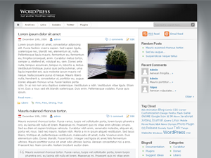
Another facelift

WordPress, how I love thee!
The iNove theme I’ve been running this site with for a considerable amount of time has done a fantastic job. It’s been a decent balance of swishy graphics and open space for lengthy, ranty content. The time has come, however, for a change.
I’d been looking out for something rather spacious and generous with how it presents text. So many sites seem to use teeny-tiny text in cramped spaces. I can understand that you need to keep a lot of supplemental content on major sites, your “Follow me on Twitter” icon, your adverts and so forth.
As for me, I have none of that concern. Just a nice spacious bachelor-pad of a website to lounge around in and do as I wish. Hey, it’s not like anyone ever visits this place directly anyway, right?
The issue I face is that many of the typography-centric WordPress themes were a little too spartan in their design and, more often than not, completely monochromatic. Yes, I could play with the CSS and tweak another’s theme to suit my own ends but I’m not sure I have the energy and I tend to find that if you ever upgrade your modified theme with a new release of the original you have to take care to re-apply your edits. It rather dents the convenience of snap-on, snap-off themes. Even more so given the convenience with which WordPress lets you install, preview and apply them.
So, if you’re reading this in your RSS reader go and have a quick visit to the actual koffdrop.com site. See? I even linked it for you just now. Aren’t I nice? It’s graphics-lite so will load reasonably quickly and I’m sure it’ll add a momentary splash of colour to your day.
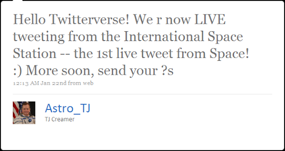
And if you’re wondering why anyone should give a hoot about typography then there’s hundreds of designers that’d like to talk to you. But, perhaps a more immediate example will give you an idea of the impact it can wield:
