Spreadsheets
 Those who know me are likely to be aware of my fondness for spreadsheets and, in particular, wrangling with Excel to get it to solve a piece of work or ongoing process I may have.
This page is a little portfolio of some of my efforts with Excel. They’re all ‘live’ examples that I’ve used in my day-to-day work.
And, if you’re wondering, yes – I have that mug.
snippets.xls
 Whenever I find a solution to a “How can I get Excel to do this for me.. ?” question I try to document it so I can refer to it later. The snippets.xls spreadsheet is a collection of some of those solutions.
I include notes on the solutions to outline the logic used or any quirks in their execution.
Examples include:
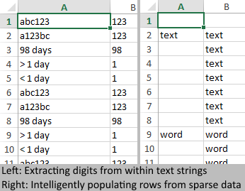
- Extracting numbers from a string of text irrespective of where the numbers are placed within the string
- Intelligently populating a column of data from sparse reference data
- creating a unique person number (UPN) based on known characteristics and adding random elements
- Highlighting duplicates in a set of data of any length
- Validating date formats
team_calendar.xls
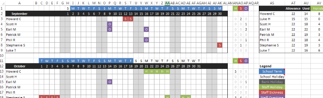
Whilst not requiring a large, enterprise-level solution, the team needed a way to review, schedule and manage attendance.
The team_calendar.xls spreadsheet mimics the layout of a wall-planner. Holidays, Sickness and Overtime are marked into the appropriate cell by typing ‘H’, ‘S’ or ‘O’ and the spreadsheet does the rest. Totals are automatically maintained and shown on a per-person and per-month basis. Relevant dates such as school terms, weekends and bank holidays are already shown in order to aid scheduling.
The primary goal was to make data as clear and immediate as possible and to ensure maintaining the data was a painless process – typically requiring a single key press or two by the manager of the data. When the file is saved a read-only version of the calendar is automatically published onto the company intranet.
new_setup_tracker.xls
When a new customer subscribed to the service, a new product setup would be initiated. Setups were multi-step pieces of work. Each step would have its own work ticket that was individually tracked in a work-ticket system. However, there was no ‘at a glance’ way to see the overall setup status for a customer. The new_setup_tracker.xls spreadsheet provides that perspective.
![]()
Each row represents a setup being implemented. The coloured columns in the centre show the elements of the setup. I employ a traffic-light system (red, amber, green) to indicate how complete each element is. As elements progress to green status, the ‘Overall’ column (column Z) provides the overall setup status visually and as a percentage.
Here are some of the mechanisms used in the new_setup_tracker.xls spreadsheet:
- Entering the number in the A column returns the full name in the B column via a remote data lookup. (The source data is no longer reachable)
- Blue text in columns marked “Ticket” are formula-driven hyperlinks. Clicking takes the user to the corresponding ticket in the work-ticket system.
- The red/amber/green statuses are set by simply typing ‘r’,’a’ or ‘g’. This updates all other progress-based values on the sheet
- Conditional formatting is used extensively to colour cells, text and convey progress automatically
- Brief guidance notes are shown in tooltips that display when the user hovers over a red triangle in a column heading
- Other tabs on the spreadsheet generate emails by using data lookups for their subject line and content. On these tabs, entering the 4-digit schema number will update the content accordingly. Emails can be initiated directly from within the spreadsheet.
- Whenever the spreadsheet is saved, a read-only version is published to the intranet. Other teams such as account managers and trainers can see the overall status of the new setup.
The goal was to have a top-level view of the status of all the elements in a new product setup. Previously it would be necessary to compile the information from assorted work-tickets to determine this. Access to these work tickets is provided in the spreadsheet via hyperlinks should the user want to review full details and notes regarding that specific element of the ongoing setup.
Making this spreadsheet easy to update was also a key focus. After a new row had been filled in, as setup progressed all that was needed was to change the ‘r’,’a’ or ‘g’ value in the appropriate column.
ticket_tracker.xls
![]() In order to gauge ongoing volumes of work-tickets being processed, s and other performance metrics it was necessary to analyse data put through the ticketing system. ticket_tracker.xls does this analysis, returns meaningful data and is straightforward to update as more data builds up.
In order to gauge ongoing volumes of work-tickets being processed, s and other performance metrics it was necessary to analyse data put through the ticketing system. ticket_tracker.xls does this analysis, returns meaningful data and is straightforward to update as more data builds up.
There are six rather busy-looking tabs to the ticket_tracker.xls spreadsheet and they’re all reasonably complex.
Two of these tabs (Data(CLW) and Data(DLW)) hold the raw data brought in from the ticketing system. This data is appended with some validation checks and a numerical ID for one of the text-fields. This ID is used to process totals on the Email tab.
The Tracker tab gives plain numbers for each week’s worth of data. It offers information on volume, lateness and performance against previous period. This data is presented as an overall and also broken down against each team member.
The second tab, called Dashboard is probably the easiest to read. An excerpt is shown to the right of this text. It builds a graph using data from the Tracker tab to give a visual impression of volumes. If you view the full graph you’ll see volumes dip sharply between weeks 30 to 35 and peak straight after. When you consider the team’s queries originate from schools, it’s understandable that the school summer holidays see a large drop in queries and the return to school in September sees their volume increase significantly.
Below the graph are pivot tables that talk to the raw data on the Data (CLW) and Data (DLW) tabs. Selecting a week number will show an expandable breakdown of the data.
The Lookups tab is present for clarity. Data Lookups are used extensively throughout the ticket_tracker.xls spreadsheet, mostly from the imported raw data but also from a couple of custom lookup tables. As the scope of the spreadsheet was growing I decided to have these lookup tables stored on their own tab where they could be easily reviewed and maintained.
The final tab, Email, invites the user to enter a week number and it then summarises key stats for that week. This content is intended for the body of a weekly email. Rather than manually enter figures into the email, it made more sense to make gathering this uniform content as autonomous as possible. Whilst the detail displayed is clear and succinct it relies on some complex lookups to pull together. For example, cell A8’s formula is:
="Category with most closed cases: "&VLOOKUP((MODE.SNGL('Data (CLW)'!K:K)),Lookups!J18:K47,2)&" ("&COUNTIF('Data (CLW)'!K:K,(MODE.SNGL('Data (CLW)'!K:K)))&")"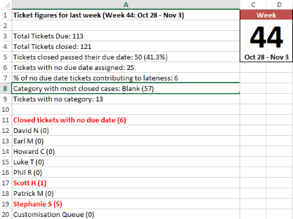 I don’t mind admitting that I didn’t get that one correct first time around!
The time spent constructing the ticket_tracker.xls spreadsheet was very much a worthwhile investment. Manually collating this data would have been an arduous task and open to ample human error.
This analysis was conducted on a weekly basis which would have meant spending a considerable amount of time had the process not become semi-automated. Updating the ticket_tracker.xls spreadsheet involved importing two sets of data – taking a few minutes at most.
I believe there is still room for improvement here. There were plans to have the spreadsheet connect directly to the work-ticket system and so always be analysing live data without the modest effort required to bring the data in manually. However, the time taken to implement this level of connectivity would have exceeded the time savings it would have offered and so was not pursued.
PlayStation Plus (EU).xlsx
Combining a number of my passions: videogames, spreadsheets and thriftiness, this spreadsheet is intended purely for my own amusement.
I subscribe to a gaming service called PlayStation Plus. Each month the service makes a number of games freely available to its subscribers. I could add up the cost of these games and could claim that the total minus the cost of the subscription tells me how much value I get from the service.
I then reasoned that, if I don’t make use of the items offered then they don’t genuinely offer value to me. So I set about listing the items, offered, their characteristics (such as regular cost and size of data) and setting some personal details against them:
- Acquired: H
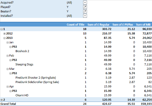 ave I claimed this item when it was offered?
 - Played: Have I played this game at all?
- Beaten: Have I played the game to completion?
- Installed: Is the game currently installed on the system?
A combination of filters and a pivot table allows me to review the data by details such as month offered and platform and see answers to somewhat abstract queries such as “What would have been the overall cost of all the games I acquired and completed in 2013?“.
Fascinating, I’m sure you’ll agree.
I decided to upload this spreadsheet to the internet, trying out both Google and Microsoft’s web-based spreadsheet applications. Microsoft proved to handle pivot tables far better than Google does, it turns out.
Having the file live online allows me to view it on any modern smart device and share it with anyone who may be interested. Each month, as more content is announced, I add its details to the spreadsheet and provide hyperlinks to each item’s product page in the service’s online store. I then have the pivot table re-process the dataset.