Although I’ve often been the type to argue gameplay is more important than graphics I’ve never denied that graphics are important.
We’re visual creatures, we make snap judgements based on appearance. We judge books by their covers. For years, the only way a game publisher had of conveying their game to their customers was through imagery. Screenshots on the back of the box and in adverts. Today we still rely on screenshots but are also provided with carefully edited trailers showing animation and audio too.
As far as games are concerned I think audio development has pretty much reached its peak. Enhancements over and above 5.1 positional audio may be too slight for the typical gamer to notice and involve more work and far too little return to be considered worthwhile. This isn’t to say that audio in games can’t be innovative, creative or surprising – just that its not hampered by any sort of technical limitations.
With the current generation, I believe we’re approaching a similar saturation point with visuals.
For decades the fidelity of game visuals was dictated by the technical performance of the host machine. Colour was once a novelty – even though it may have been used sparingly due to technical constraints. As resolutions and palettes improved so did the ability to convey characters and activities on-screen.
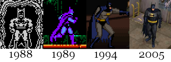
Initially the task was to simply get imagery up on the screen that was functional enough to portray what was going on. Sacrifices often had to be made due to technical constraints or considerations where graphics favoured clarity over detail.
With today’s systems there is sufficient power to portray the functional with enough left over (and expected by the consumers) to adopt a specific style. This is where the medium has a chance to elevate itself and mature.
Whilst there will always be a need to portray characters and entities in a conventional way that communicates clearly with those viewing them, there’s scope to add distinctiveness and style to things these days. The best games will have some sort of justification to their style rather than adopting, say, cel-shading, for the hell of it.
Zelda is one such instance that serves as a good example.
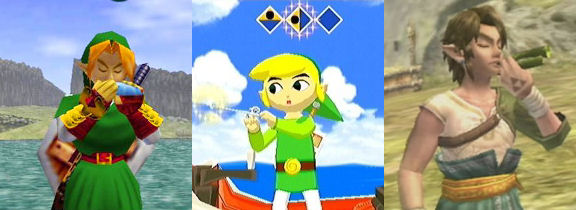
Whilst Ocarina of Time reflects an era where technological limitations were still a dominant factor with video game graphics it’s clear that it’s successor (Wind Waker) chose a radically different art style to depict similar characters such as Link. The next Zelda game dropped the striking visual theme and returned to a more conventional method but exploited the greater technical power available at the time.
I’m not the type to go doe-eyed at the mention of Zelda like some. However, I thought that Nintendo’s decision to make such a remarkable break from tradition (particularly in a franchise built entirely on tradition) was quite brave and, dare I say it, innovative.
I recall reading a quote from Nintendo that stated that the visual style was a result of the desire to convey expression and emotion more effectively in the game. Given that traditionally the Zelda franchise features a silent protagonist it makes a lot of sense to utilise expression as a way to enhance the sense of communication between Link and other characters. It’s even apparent on the screenshot selection I chose above. Link is playing an instrument in each game but the centre image really shows expression on Link’s face compared to his two neighbours.
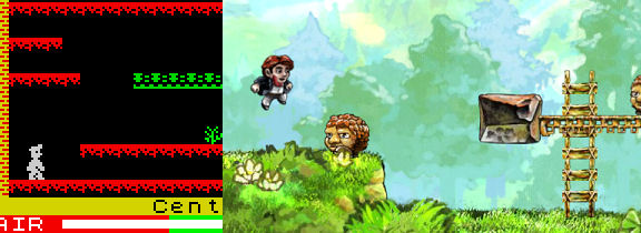
Braid is another example of a game that goes way beyond the functional requirements of it’s graphics and utilises style to enhance communication and narrative. Where once we could see blocky pixels of a single colour we now get a style that suggests hand-drawn imagery rather than something designed for a grid. What’s not apparent from the static image of Braid is the way the imagery serves the time-manipulation aspect of gameplay. Sunbeams gently pulsating outwards from the sun, fluffy clouds rolling across the screen and wisping in and out of themselves – all this movement is in keeping with the visual theme chosen by the game developer but the movement of the images shows the player which way time is flowing (if at all). Style serving a function.
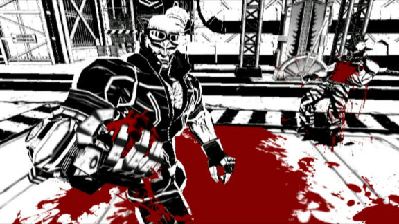
Alas, in my opinion Braid is so far up it’s own ass with being smugly clever and post-modern it’s a game that’s far easier to appreciate than to enjoy. I found it interesting that the character in the game was grounded in the mundane – running and jumping through fantastical levels in a suit and tie. Like other parts of the game, I’m sure this is meant to support a greater profound theme hidden somewhere within. What I realised when selecting the Manic Miner image above is that Miner Willy’s profession is also clearly depicted in the game. His miner’s helmet with a lamp on the front is apparent in spite of the character sprite only being a few pixels tall and composed of a single colour. Perhaps, in the same way that Mario in Donkey Kong had a moustache as it was easier than drawing a mouth a miner’s hat was an alternative to a hairstyle.
So what’s next?
With technology increasingly becoming something that enables creativity rather than limits it I think it’s really down to the inventiveness and creativity of the people directing videogame art. The art has to be functional – that’s always got to be there, but layered on top of that.. ..who knows? Being immersed in impossible worlds still works wonders for books and movies. Being able to reach out, touch and explore those worlds is something only games can offer.
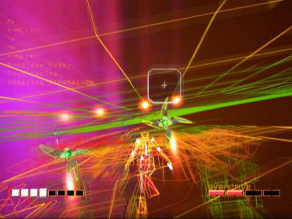
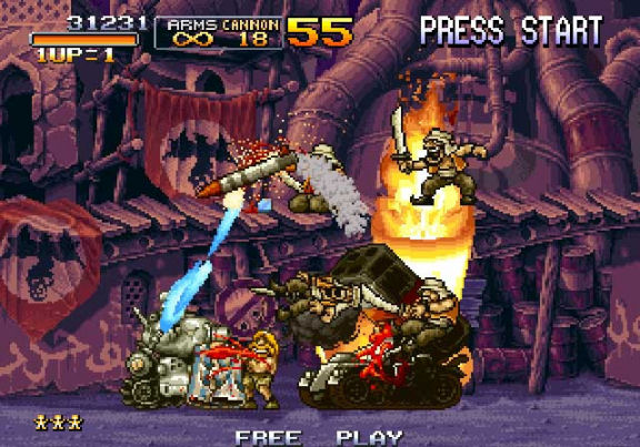
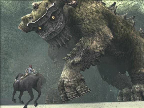
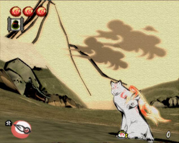
Here’s a selection of videogames that, in my opinion, showcase style above and beyond the functional to enrich the gamesplaying experience. This isn’t just me choosing games that look pretty but games that deliberately chose a theme and visual direction.
Don’t worry if a game you feel worthy isn’t shown above. The images are to illustrate a point, not be an exhaustive or definitive guide.